
Shadow DOM
...the most mysterious web component
Created by @derekhoman
It's all about the Encapulations
baby

Quick Example - HTML
<div id="slider">
<input checked="" type="radio" name="slider" id="slide1" selected="false">
<input type="radio" name="slider" id="slide2" selected="false">
<input type="radio" name="slider" id="slide3" selected="false">
<input type="radio" name="slider" id="slide4" selected="false">
<div id="slides">
<div id="overflow">
<div class="inner">
<article>
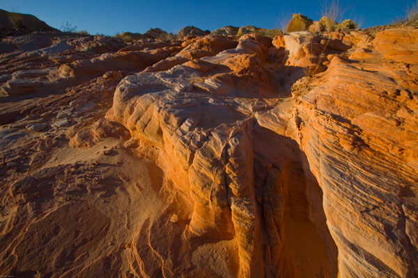
<img src="https://s3-us-west-2.amazonaws.com/s.cdpn.io/5689/rock.jpg">
</article>
<article>
<img src="https://s3-us-west-2.amazonaws.com/s.cdpn.io/5689/grooves.jpg">
</article>
<article>
<img src="https://s3-us-west-2.amazonaws.com/s.cdpn.io/5689/arch.jpg">
</article>
<article>
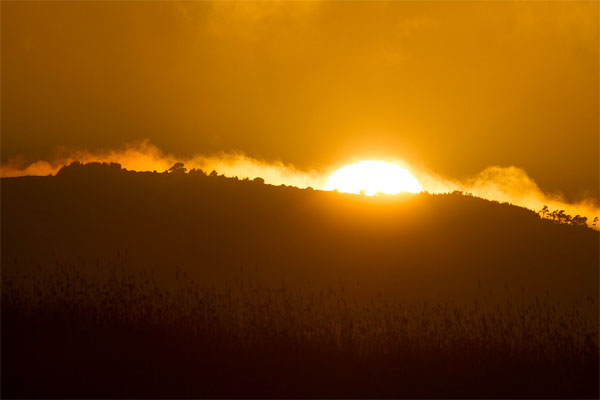
<img src="https://s3-us-west-2.amazonaws.com/s.cdpn.io/5689/sunset.jpg">
</article>
</div>
</div>
</div>
<label for="slide1"></label>
<label for="slide2"></label>
<label for="slide3"></label>
<label for="slide4"></label>
</div>
Quick Example - CSS
* {
  -webkit-box-sizing: border-box;
  -moz-box-sizing: border-box;
  -ms-box-sizing: border-box;
  box-sizing: border-box;
}

#slider {
  max-width: 600px;
  text-align: center;
  margin: 0 auto;
}

#overflow {
  width: 100%;
  overflow: hidden;
}

#slides .inner {
  width: 400%;
}

#slides .inner {
  -webkit-transform: translateZ(0);
  -moz-transform: translateZ(0);
  -o-transform: translateZ(0);
  -ms-transform: translateZ(0);
  transform: translateZ(0);

  -webkit-transition: all 800ms cubic-bezier(0.770, 0.000, 0.175, 1.000);
  -moz-transition: all 800ms cubic-bezier(0.770, 0.000, 0.175, 1.000);
  -o-transition: all 800ms cubic-bezier(0.770, 0.000, 0.175, 1.000);
  -ms-transition: all 800ms cubic-bezier(0.770, 0.000, 0.175, 1.000);
  transition: all 800ms cubic-bezier(0.770, 0.000, 0.175, 1.000);

  -webkit-transition-timing-function: cubic-bezier(0.770, 0.000, 0.175, 1.000);
  -moz-transition-timing-function: cubic-bezier(0.770, 0.000, 0.175, 1.000);
  -o-transition-timing-function: cubic-bezier(0.770, 0.000, 0.175, 1.000);
  -ms-transition-timing-function: cubic-bezier(0.770, 0.000, 0.175, 1.000);
  transition-timing-function: cubic-bezier(0.770, 0.000, 0.175, 1.000);
}

#slides article {
  width: 25%;
  float: left;
}

#slide1:checked ~ #slides .inner {
  margin-left: 0;
}

#slide2:checked ~ #slides .inner {
  margin-left: -100%;
}

#slide3:checked ~ #slides .inner {
  margin-left: -200%;
}

#slide4:checked ~ #slides .inner {
  margin-left: -300%;
}

input[type="radio"] {
  display: none;
}

label {
  background: #CCC;
  display: inline-block;
  cursor: pointer;
  width: 10px;
  height: 10px;
  border-radius: 5px;
}

#slide1:checked ~ label[for="slide1"],
#slide2:checked ~ label[for="slide2"],
#slide3:checked ~ label[for="slide3"],
#slide4:checked ~ label[for="slide4"] {
  background: #333;
}
Result

That's Cool...
... but
- that's a lot of code
- kind of messy
- prone to failure
- ie css rule changes

Things like:
- stylesheets
- javascript
- other IDs of other DOM objects
could all break yo stuff
Even if your code is indestructible
you have to admit
<img-slider>
  <img src="./sunset.jpg" alt="a dramatic sunset">
  <img src="./arch.jpg" alt="a rock arch">
  <img src="./grooves.jpg" alt="some neat grooves">
  <img src="./rock.jpg" alt="an interesting rock">
</img-slider>
looks a lot better
Web Components
set of standards for building widgets
- ... which can be reused
- ... and won't break*
*Assuming you don't do anything stupid
The Web Components
Shadow DOM
fixes a fundamental problem
DOM tree inside a widget isn't encapsulated
Shadow DOM - basics
- Shadow Root - the new kind of a node associated with the shadow host
- Shadow Host - the html element with a shadow root associated with it
For Example
<button>Hello, world!</button>
<script>
var host = document.querySelector('button');
var root = host.createShadowRoot();
root.textContent = 'Puppies';
</script>
Instead of
We'd Get
Additional Cool Things
Content Tags
<template>
  ...
  <div class="inner">
    <article>
      <content select="img:nth-of-type(1)"></content>
    </article>
    <article>
      <content select="img:nth-of-type(2)"></content>
    </article>
    <article>
      <content select="img:nth-of-type(3)"></content>
    </article>
    <article>
      <content select="img:nth-of-type(4)"></content>
    </article>
  </div>
</template>
Would let us simply the html to...
<div class="img-slider">
  <img src="./rock.jpg" alt="an interesting rock">
  <img src="./grooves.jpg" alt="some neat grooves">
  <img src="./arch.jpg" alt="a rock arch">
  <img src="./sunset.jpg" alt="a dramatic sunset">
</div>
CSS - Host Selector
:host selector (could be combined with :hover, :focus, :active, etc)
:host(:hover) {stuff: awesome;}
Host Context Selector
:host selector (could be combined with :hover, :focus, :active, etc)
:host(:hover) {stuff: awesome;}
For more Info
- http://www.html5rocks.com/en/tutorials/webcomponents/shadowdom/
- http://www.html5rocks.com/en/tutorials/webcomponents/shadowdom-201/
- http://www.html5rocks.com/en/tutorials/webcomponents/shadowdom-301/
- http://www.html5rocks.com/tutorials/webcomponents/customelements/
- http://updates.html5rocks.com/2013/03/Visualizing-Shadow-DOM-Concepts
- http://glazkov.com/2011/01/14/what-the-heck-is-shadow-dom/